Be yourself; Everyone else is already taken.
— Oscar Wilde.
This is the first post on my new blog. I’m just getting this new blog going, so stay tuned for more. Subscribe below to get notified when I post new updates.
Be yourself; Everyone else is already taken.
— Oscar Wilde.
This is the first post on my new blog. I’m just getting this new blog going, so stay tuned for more. Subscribe below to get notified when I post new updates.
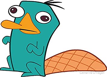

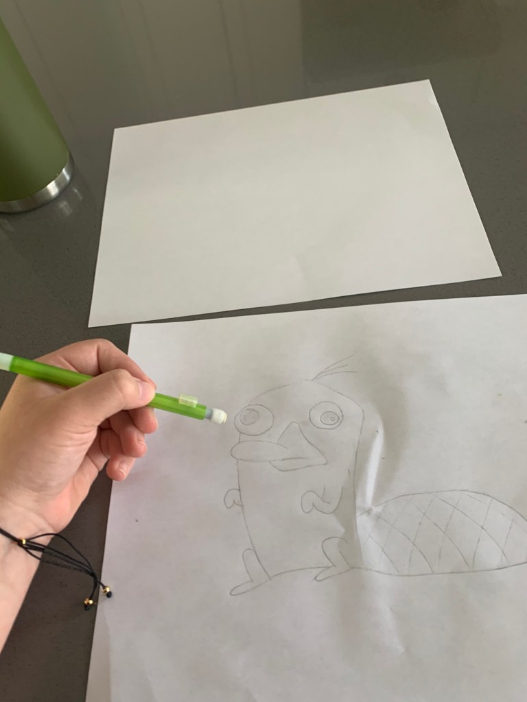
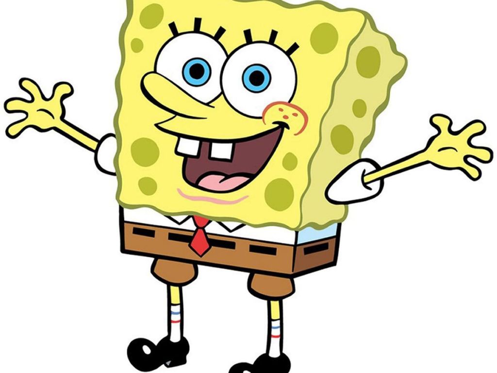
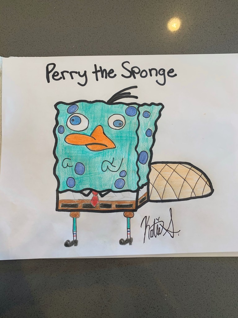
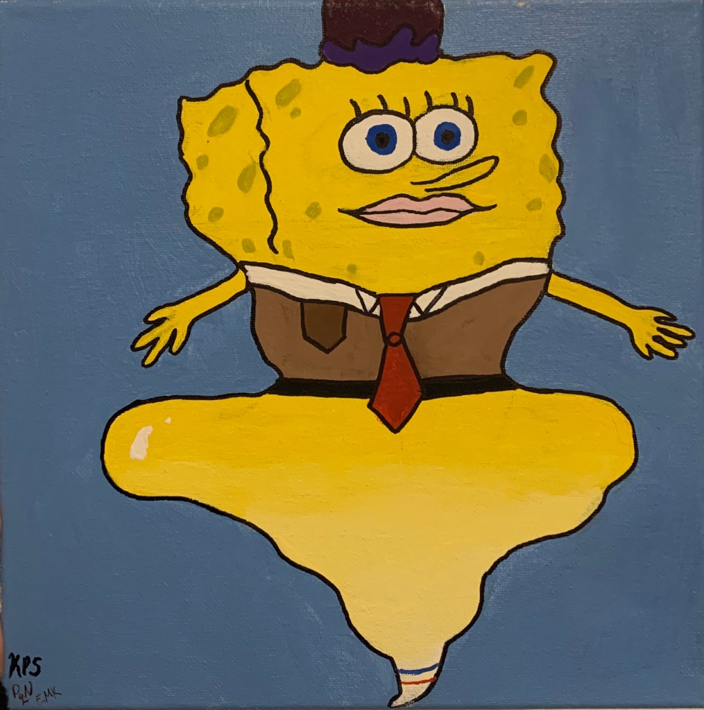
I got the idea to “remix” two cartoons I loved as a child from a Tiktok video I saw a few months ago. First I started with drawing the character Perry the Platypus then erased it so I could only see faint lines. Over the faint lines I added features off the famous cartoon character Spongebob. Once u was happy with how everything lined up I colored it in to match the color of Perry the Platypus but kept the eye color of Spongebob. After filling it in with color I outlined everything with Sharpie to define the lines I wanted to keep. The process of making this remix drawing was fun to make and I hope it makes other laugh like it did while I was making it.
Katie Slagle
Zucman
Art 110
03 May 2020
Artist Conversation
Kiyomi Fukui is a graduate student with a MFA in printmaking at California State University Long Beach and a BFA in Graphic Design from La Sierra University. She also does fiber arts like tatting and crocheting. Fukui’s bio states that she “attempt[s] to capture transient intimacy, irrespective of media” with her art.
In Kiyomi Fukui art she regularly uses things that are natural such as plants, seeds, and leaves. A lot of her projects are very interactive and often allow people to express their individuality. As Kiyomi’s projects are interactive they are usually on a larger scale with her “Green Thumb” project starting small and becoming big as peoples thumb plants began to grow and as people took them back home. She seems to have a theme of using nature and paper products. She typically uses white for a majority of her projects while mixing in live green plants for a pop of color giving the scene a clean but natural vibe.
The question I was thinking was “what are your favorite projects or works?”. Fukui said she really likes her “Green Thumb” project because it helped her coup with her mother’s passing from cancer, however her favorite since piece of art that she made was called “I Was There” and it is a print she made of a bird that as dying after her roomate’s cat attacked it and brought it back as a “gift”. Kiyomi explained that she decided to do a print of the dying bird so that she could be there with the bird in its final moments and to appreciate the bird.
I enjoyed Kiyomi Fukui’s work as it was very simple to the eye but behind that simplicity had such a deep meaning that can really make you think and reflect about yourself. My favorite project that I wish I could have been a part of is “Tea at 3307” because it seemed like such a good way to bond with people. I also liked that the project really had no right or wrong as a person could make tea however they like and paint the paper in whatever way feels right to them, making each paper is completely unique from the last.
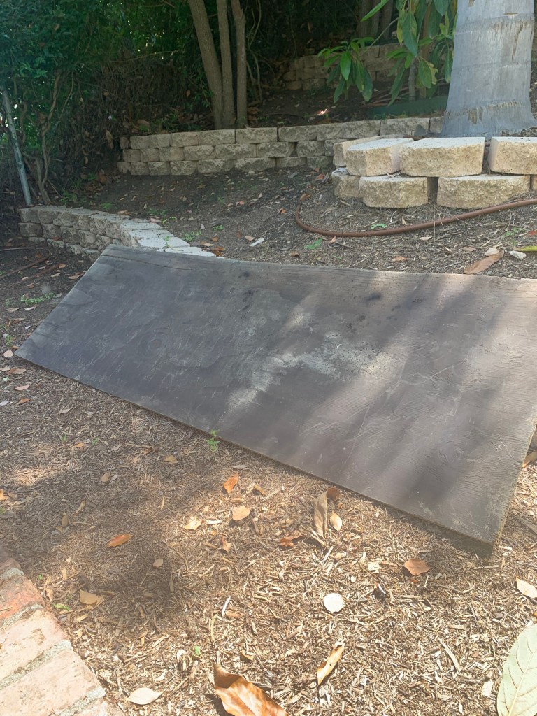
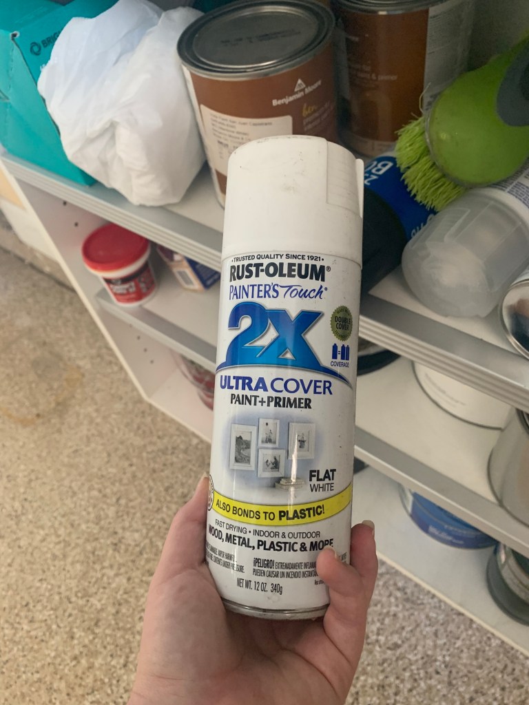
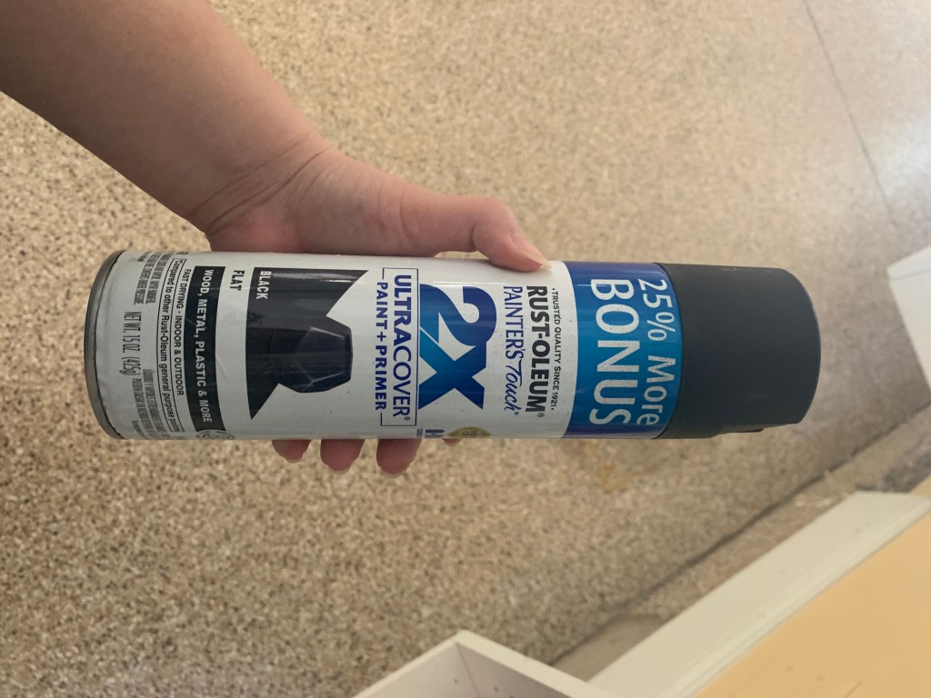
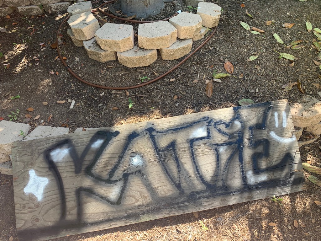
I used an old piece of plywood that my dad found in the backyard for the graffiti surface. Thankfully i was able to find some extra spray paint in the garage from past projects however we only had white and black so my graffiti art wouldn’t be as bring and colorful as I would have liked. Overall the process of using the spray paint was fun except the wood would soak up the paint fast so it took multiple layers to make the lines of each letter defined enough. I added some splotches of white since the can easily running low after I sprayed the diamond and smiley face.
When searching for virtual art I found a list titled “25 Internet Artists You Need to Know” so that is how I found Jonas Lund, Lorna Mills, and Tabor Robak. All of their internet art is very different from one another but that is why I chose them, I wanted to show that there are so many different styles to virtual art.
The first artist I looked at was Jonas Lund from Amsterdam. His art attracted be because of the simplistic look of it but also the use of very bright colors with white and black as accents which further extenuate the vividness of the other colors. This work has a very modern look and I could see it being hung up somewhere very fancy.


The next internet artist I chose was Lorna Mills who is based in Toronto. Her artwork is very different from my other two artists as she uses GIFs (graphic interchange format) as her form of art. Because Lorna Mills makes GIFs as her form of art they can only fully be enjoyed digitally since they must move on a screen. I likes Lorna Mills work as it is very chaotic and humorous as the GIFs she makes seem to contain very odd images that normally don’t go together.


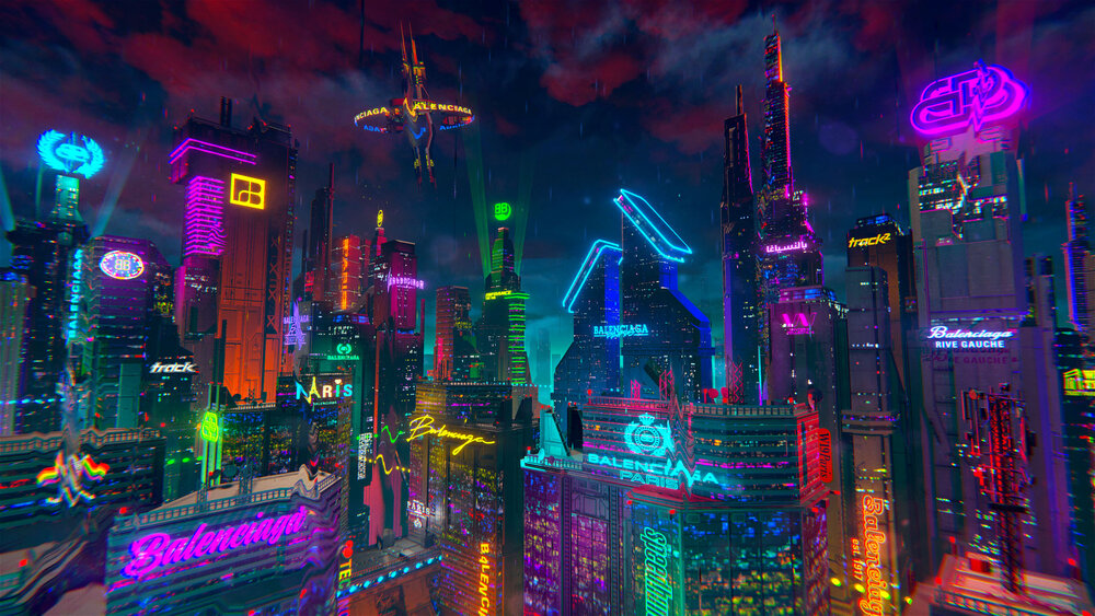
The last artist I chose was Tabor Robak who is from New York. His art is realistic but in a very animated way. He utilizes bright colors that pop and make his work seem like it is actually glowing. Most of his art seems to be styles to look like a video game. MY favorite piece by him shows how his work looks almost like real life but elevated in a futuristic way.
Katie Slagle
Glenn Zucman
Art 110- Intro into Visual Arts
29 March 2020
Artist Conversation
Maccabee Shelley was originally going to school for environmental science until he chose to go down the path of art. He eventually went on to earn his bachelor’s degree at Humbolt State Univerity in studio arts and art history all while being a studio technician and teaching assistant at City College of San Fransico. After he later attended California State Univerity Long Beach for two post-baccalaureate years and then went to Italy two summers in a row and assisted other students with their art. In 2019 Shelley graduated with his FMA’s in ceramics in 2019.
Maccabee’s work is very textured with many jagged edges and using many colors. The colors used are vivid and bright with a few more muted tones do go with very bold colors. His projects have a lot of dimension and many seem to be quite large in size. The pieces all seem to look melted together to create more color, texture, and more individuality to each work.
I have not seen any artist use technique’s like the one used by Maccabee. I would like to know more about how he created each individual piece and all the materials used and how he mixed them to create the different layers and colors in each piece. I also would like to know why he chose to work with ceramics, glass, mixed-media, installation.After digitally viewing Maccabee Shelley’s exhibition, No Redemption Value, off of his website I can see how art is not always using one kind of art media to create a piece and that you can mix them to create something entirely new and unique. Art also does not have to look like anything seen before but can be simply admiring the beauty of the way things melt, combine, and mix together to become one.
My favorite piece of Maccabee Shelley’s No Redemption Value exhibition
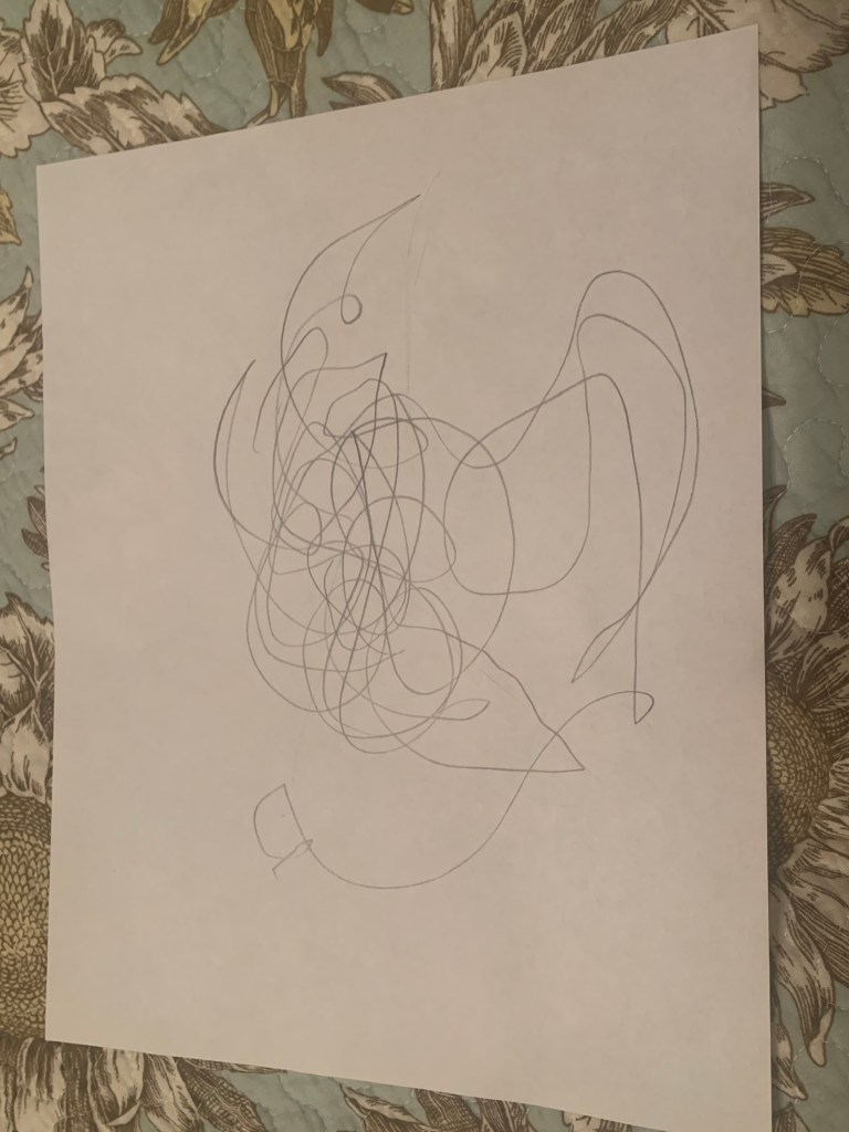
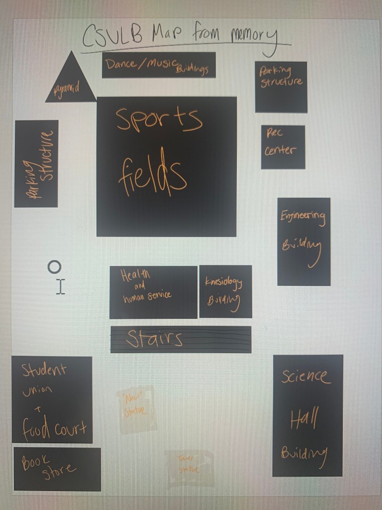
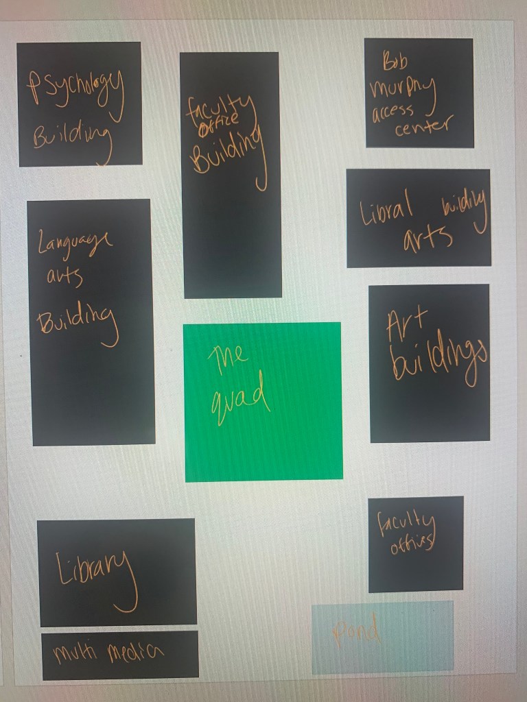
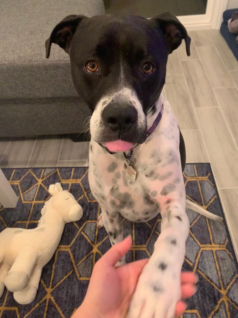
Drawing a map from memory was really tough to remember especially since I have not been on campus for a while now. It was easier to remember where certain buildings were when I closed my eyes and thought about my normal walking routes around campus. I know I missed a few buildings since I do not necessarily “use” every building on campus. I also decided to draw my map digitally rather than on paper so I could color code the map easier. For the Human Spirograph I had my grandma help me and as seen in the photo we did not draw much outside of the center of the page. Upon turning the page a few times we noticed that what we made resembled some sort of bird flying. Overall the human Spirograph was a fun activity to do especially with my grandma who I have not been able to see recently.